Most app description guides treat the 4,000-character field as one block of text. That is the wrong mental model. The App Store description is actually two products glued together: the first three lines that everyone reads, and a long body that 95% of visitors never expand. Once you write to that fold, every other decision (keyword placement, social proof, length) becomes obvious.
Q:How do I write a good app description?
A: Front-load the first 3 lines (about 170 characters) with the single benefit users get and the proof they should believe you. Then use the remaining 3,830 characters for keyword-rich features, social proof, and a clear call to download. The first 3 lines drive conversion. The body drives Google Play search ranking and gives App Store reviewers context.
- 1.First 3 lines: hook + proof + emotional benefit. No throat-clearing.
- 2.Body: 7-section template with feature list, social proof, IAP terms, links, contact.
- 3.iOS: description is NOT indexed for keywords - the 100-char keyword field is.
- 4.Google Play: description IS the keyword field - density and natural phrasing matter.
- 5.Localize for the top 7 markets - a translated description outperforms a better English one.
The 4,000-character architecture
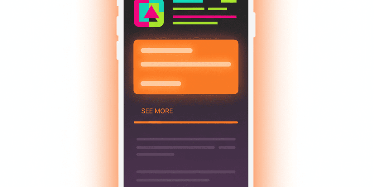
Open the App Store on your phone. Tap any app. Look at the description section. You see roughly three lines, then a “See More” link. That fold is the entire user-facing description for the vast majority of visitors.
Sensor Tower and AppTweak product analytics consistently show that somewhere between 2% and 5% of App Store product page visitors tap See More. That means the bottom 3,830 characters of your description are seen by almost nobody who is actually deciding whether to install. So what is that body for?
Two things, and they are not the same thing. On Apple, the body gives the App Review team context (and search reviewers data they can use to judge listing quality), and it shows up to the small percentage of users who do expand. On Google Play, the body IS the keyword index - the algorithm reads every word and weights them by frequency and position.
Two products in one field
The first 3 lines are conversion copy aimed at humans. The body below the fold is for the algorithm (Google Play) and edge cases (App Review, the small percentage of curious users). Write each separately.
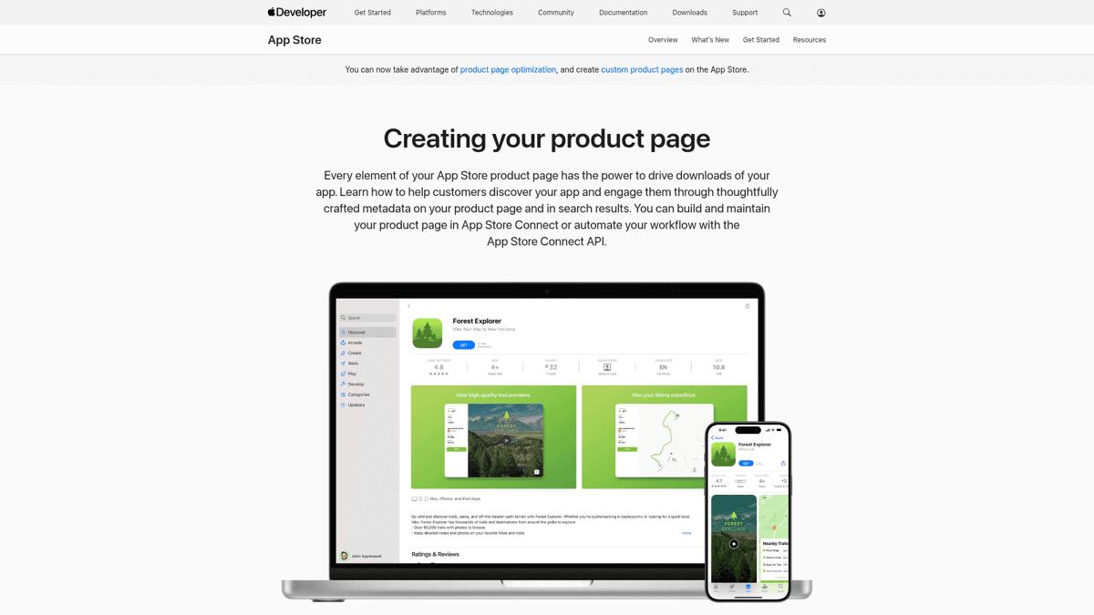
Apple's product page docs - notice how the description sits below screenshots and ratings. By the time users scroll there, you have already won or lost on visuals.
App Store vs Google Play: the rules that actually differ
Both stores cap descriptions at 4,000 characters. Almost everything else is different. These are the rule deltas that actually change how you write.
| Rule | Apple App Store | Google Play |
|---|---|---|
| Description max length | 4,000 chars | 4,000 chars |
| Short field that users see first | Promotional Text 170 chars (editable anytime, no resubmission) | Short Description 80 chars (counted by the algorithm) |
| Algorithm reads description for keywords? | No - keyword field is separate (100 chars) | Yes - description IS the keyword field |
| Markdown / HTML allowed | No - plain text only | Limited HTML (b, i, u, br) supported |
| Editable without resubmission? | Promo Text yes, description no | Anytime |
| Links to other apps | Allowed only via App Store URL | Discouraged - violates spam policy |
| Price mentions in description | Banned - rejection trigger | Allowed |
| Mentioning competitors / other platforms | Banned (Android refs trigger rejection) | Allowed |
The two stores share a character cap and almost nothing else.
The biggest practical implication: on iOS you can swap your Promotional Text for a flash sale message or a launch announcement without triggering a full review cycle. On Google Play you can edit the entire description anytime, but every edit risks a temporary ranking dip while the algorithm re-indexes.
The first 3 lines: where 95% of the decision happens
About 170 characters fit above the See More fold on most modern iPhone screens. That is your entire pitch. Treat it like an elevator pitch - not a feature list, not a tagline, not your company mission.
The reliable formula is hook, proof, then emotional benefit:
Line 1: the hook (one concrete benefit)
State the single most useful thing the app does in plain words. Not 'productivity reimagined' - 'plan your week in 5 minutes'. Specific verbs beat abstract nouns.
Line 2: the proof
Press quote, app of the day, user count, or rating. Anything external that says 'other people trust this'. If you have nothing yet, use a specific feature claim with a number ('300+ exercises', 'syncs in under 2 seconds').
Line 3: the emotional pivot
What does using this app feel like, or what does it free the user from? Short, slightly punchy, slightly aspirational. Save the feature list for after the fold.
A common mistake is writing about saving time or being “the easiest way to X.” That phrasing is invisible because every app claims it. A user on r/AppStoreOptimization put it bluntly when critiquing a meditation app:
Critique on vague benefit copy
“instead of saying your app saves time, i personally don't find it interesting. you need to emphasize your awesome sounds collection with visuals. help your user to imagine the sounds using the visuals.”
The fix is concreteness. Replace abstract benefits with sensory or numeric details (the sounds, the catalog size, the 60-second workflow). That is what makes the first three lines actually do work instead of just filling space.
The body: structure that converts and indexes
Below the fold, you are writing for two audiences: the small group of users who actually expand the description, and the Google Play algorithm (on iOS, the App Review team). The same 7-section template serves both well.
Open with the second hook
Restate the value prop from a different angle. Don't repeat the first 3 lines verbatim. This is the line a user sees right after tapping See More - reward the tap.
Feature sets (5-8 features, scannable)
One line per feature. Lead with the benefit, not the feature name. 'Track every meal in 10 seconds' beats 'Meal Tracker'. Use line breaks and the occasional emoji - sparingly.
Social proof block
Press quotes, awards, user count, ratings, notable mentions. Real numbers and named publications outperform vague adjectives. Two strong proofs beat seven weak ones.
Subscription / IAP terms (required by Apple)
List trial duration, renewal cadence, cancellation steps, and pricing tier names. Apple rejects vague monetization language. Even if you do not have a subscription, mention IAPs clearly.
Privacy and terms links
Plain URLs (Apple) or HTML anchors (Google Play). Required by both. Use root URLs (yourdomain.com/privacy) - long URL paths look spammy and sometimes get flagged.
Contact info
Support email and website. Apple cares more than Google Play - missing contact info shows up in App Review feedback. A real domain looks more credible than a Gmail address.
Call to download
Optional, but a confident closing line ('Download X today and start your first session in 60 seconds') outperforms petering-out endings. Avoid hype words ('amazing', 'best') - Apple flags them.
Keep individual lines short - 8 to 12 words on average. Long descriptions read fine in a browser but the App Store and Google Play renderers add line breaks aggressively, which can chop a 25-word sentence into a wall of text on iPhone.
Keyword strategy: description vs keyword field
This is where most guides muddy the water. The two stores treat keywords completely differently, so you need two strategies, not one.
On iOS, the description body is NOT indexed for keyword search. Apple ranks apps using your title (30 chars), subtitle (30 chars), and the 100-character keyword field plus signals like installs and ratings. Stuffing keywords into the description body does nothing for ranking - it just makes your copy worse.
On Google Play, it is the opposite. The full description IS the keyword index. Google uses TF-IDF style scoring on the description and short description, weighted by position and frequency. A keyword that appears 4-5 times naturally in a 4,000-character description will outrank one that appears once. See our Google Play ASO guide for the density specifics.
Validates the dual-store keyword strategy
“Use high-intent keywords in your title + short description. Add 8-12 strong keywords in App Store keyword field. Optimize your long description with natural keyword density. Localize your listing for top countries.”
The practical workflow is to do keyword research once, then split the output into two buckets: 8-12 high-intent terms for the iOS keyword field, and 4-6 priority terms to weave naturally into the Google Play description body. Same research input, different placement output.
Where ASO Maniac fits
ASO Maniac's keyword popularity scoring (1-100) tells you which keywords actually deserve a slot in the iOS 100-char field versus which ones belong in the Google Play description body. The same keyword can be a winner on one store and dead on the other - and the popularity score makes that obvious before you publish. Try it at asomaniac.com.
Real top-app description teardowns
Theory is cheap. Look at how apps that rank for everything actually write their descriptions. Two examples worth dissecting: Duolingo on Google Play and Notion on iOS.
Duolingo on Google Play
Duolingo’s Google Play description is a textbook example of writing for both humans and the algorithm. The first 80 characters (the short description) hit the keyword bullseye: “Play, watch and chat your way to fluency!”- casual tone, three target verbs, “fluency” as the head keyword.
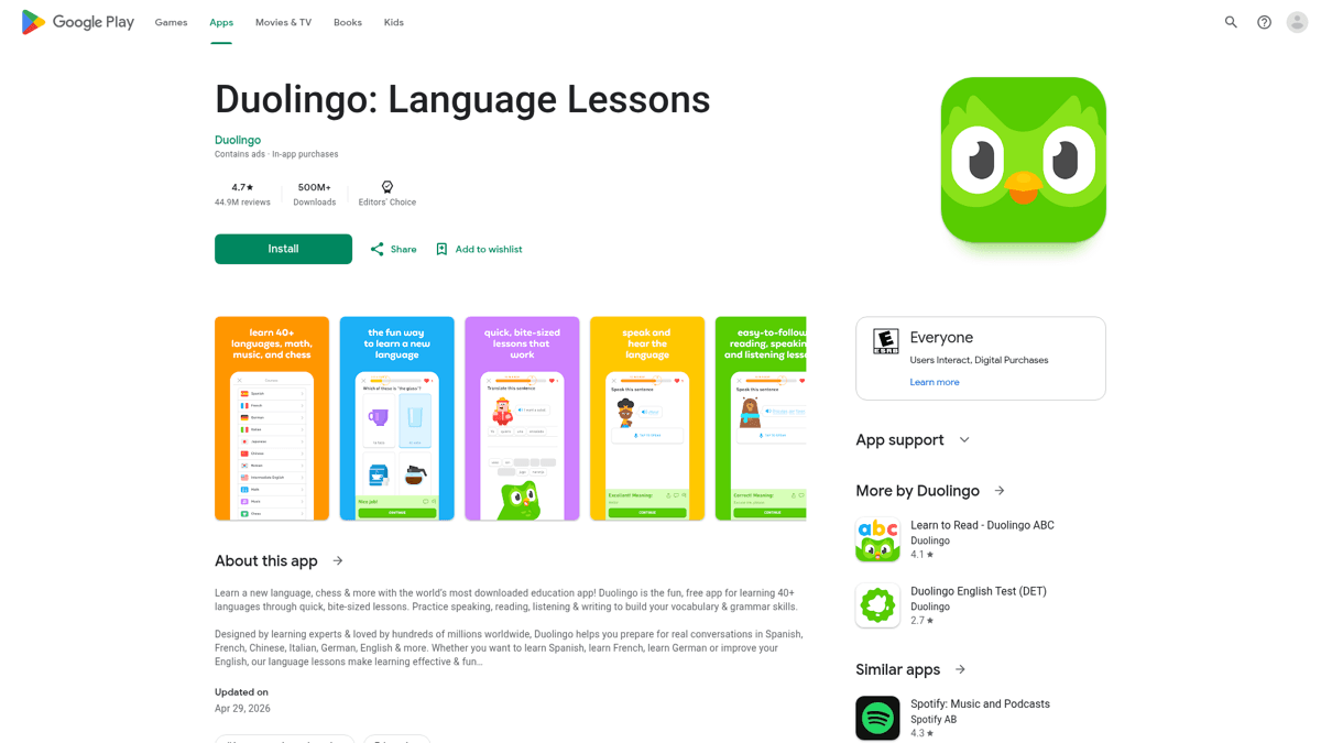
Duolingo on Google Play: short description hits the head keyword, long body weaves it through every section.
The long description hammers “learn a language” and “language learning” throughout, but always inside a sentence that reads naturally. No keyword stuffing - just the same phrase used in context 6-8 times across 3,500+ characters. That is what natural keyword density looks like in practice.
Notion on iOS
Notion takes the opposite approach. Their iOS description body almost ignores keywords (because Apple does not index them) and instead reads like a feature catalog. The first three lines are the entire pitch: the all-in-one workspace claim, Time magazine quote, and a list of what you can do. Below the fold is a long, dense feature list and IAP terms - functional, not marketing copy.
The lesson: write for the right audience. If you find your iOS description loaded with keyword phrases, you are wasting space that Apple does not read. If your Google Play description reads like a feature catalog with no head keyword in the first 80 characters, you are leaving rank on the table.
AI description generators: honest take
AI-generated descriptions are everywhere now. writeme.ai ranks for the keyword. ChatGPT and Claude both produce passable first drafts. The question is whether to use them.
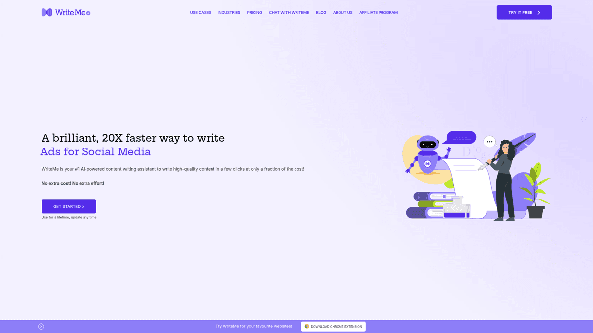
writeme.ai is the most prominent dedicated AI description tool. Output is generic but useful for breaking writer's block.
The honest answer: AI is a draft accelerator, not a replacement. Dedicated generators like writeme.ai produce competent but interchangeable copy. Open them and you can spot the AI-generated-by-default phrasing - “Discover the power of...”, “Take your X to the next level...”, “Whether you are a beginner or...”. Apple reviewers see thousands of submissions; this voice is invisible.
AI description generators in 2026
Pros
- ✓Fast first draft - useful when you are stuck
- ✓Free tiers exist (writeme, ChatGPT free)
- ✓Good at structure - they will hit all 7 sections
- ✓Multilingual - decent at locale variants when prompted
Cons
- ✗Generic phrasing readers (and reviewers) ignore
- ✗No keyword data input - garbage in, garbage out
- ✗One description for both stores - misses iOS vs Google Play differences
- ✗Hallucinated character counts - always verify the 4,000-char and 80-char limits manually
- ✗No localization that captures cultural context (just literal translation)
General-purpose LLMs (ChatGPT, Claude) outperform dedicated tools if you feed them real keyword data and your existing brand voice as examples. Paste your top 10 keyword candidates with their popularity scores, paste 2-3 of your existing app descriptions or marketing copy, and ask for a draft. Then rewrite the first three lines yourself - AI is bad at the hook.
Localization: a translated description beats a better-written English one
This is the highest-ROI optimization most indie developers skip. Localizing your description for the top 7 non-English markets typically outperforms any amount of English copy polishing. The lift comes from two places: keyword indexing in the local language (Apple and Google Play index per locale) and local-language reviewers looking favorably on properly localized listings.
The top 7 locales by install volume for most indie apps: English (US), Spanish (Spain + LatAm), German, French, Japanese, Brazilian Portuguese, and Simplified Chinese. Localize in that order. The biggest single win on iOS is that each locale has its own 100-char keyword field - localizing four locales effectively gives you 400 characters of keyword space instead of 100.
Rejection triggers: what NOT to put in your description
Apple App Review rejects descriptions for specific patterns that no official guide lists clearly. The list below is community-validated from r/iOSProgramming, where developers share rejection reasons after the fact.
Battle-scarred rejection list from a developer
“Nothing 'beta' or 'coming soon' in the app. No reference to an Android version if you have one. If your app has a way to create an account, add a way to delete an account. Have a privacy statement at yourdomain.com/privacy. If the app has freemium/subscription, be very clear about that. SOURCE: Battle scars”
🚫 Description language that triggers App Review rejection
Avoid all of the following: 'Beta', 'coming soon', or 'preview' language. Any reference to an Android version (or other platforms unless that is a core feature). Competitor app names. Price mentions ('$4.99', 'free', 'discounted now'). Version numbers in the body. Placeholder text or lorem ipsum. Marketing superlatives Apple considers misleading ('best app ever', 'guaranteed results', '#1 in the world').
The cross-platform rule trips up the most developers. If you have a web version or an Android version of your app, do not mention it in the iOS description - even saying “available on the web” can trigger a 4.0 rejection.
Specific cross-platform rejection trigger
“Make sure your app avoids mentioning other platforms (Android etc) unless that is a core feature of the app.”
And keep perspective. Description tweaks alone do not save a bad product. The best Reddit comment on the entire ASO conversation was also the bluntest:
Counter-perspective on description importance
“Don't worry about it. When you go to find a new app - are you just randomly browsing the App Store? No - you google for recommendations for an app that does what you want and then find that app by name. Worry about getting people talking about and reviewing your app off the App Store.”
The description matters at the margin and for keyword discoverability on Google Play. Off-store marketing matters more. Both, not either. See our discoverability channels guide for the full channel map.
Description audit checklist
Run through this before you ship a new description or refresh an existing one. If any item is unchecked, fix it before publishing.
✅App description audit
Pre-publish review for any description change
First 3 lines (about 170 chars) deliver hook + proof + emotional benefit
No vague benefit phrasing ('save time', 'easiest way to X')
Body uses the 7-section template (open, features, social proof, IAP terms, links, contact, CTA)
Feature lines lead with benefit, not feature name
iOS: keywords are NOT stuffed into the description body
Google Play: 4-6 priority keywords appear naturally throughout
No banned terms (beta, coming soon, Android refs, prices, competitor names, version numbers)
Subscription / IAP terms are clear (trial length, renewal, cancellation)
Privacy and Terms URLs work and resolve to actual pages
Localized for at least 4 markets (English, Spanish, German, French baseline)
Summary
The App Store description is two products in one field. The first three lines are conversion copy aimed at the 95% of users who never tap See More. The body below the fold is for the algorithm (Google Play) and the App Review team (iOS). Write each separately, with the right audience in mind, and you will outperform descriptions that try to do everything at once.
Two practical takeaways: write the first three lines last, after the body, so you know what to compress into the hook. And localize before you polish - a translated description for four extra markets beats any amount of rewriting in English. The fold is the framework. The rest is just execution.